BUILDING A VISUAL IDENTITY
OWL BEAN
Intro
The Brand
Mission
Statement
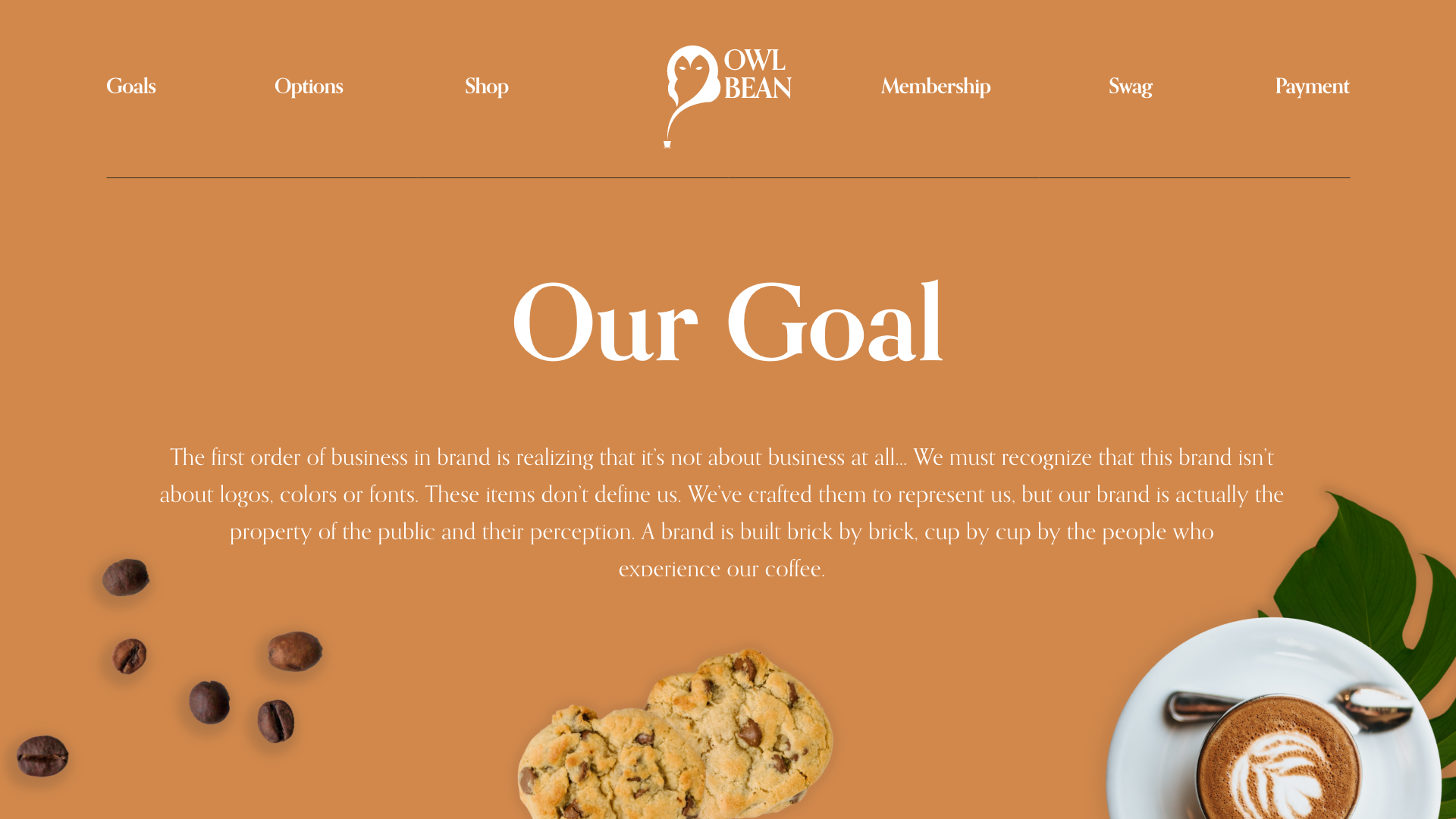
A brand is built brick by brick, day by day, cup by cup by the people who experience our coffee.
It’s about people, it always has been. It’s about creating a place for relationships to grow – for conversations to happen.
Every customer is a VIP. We honor them with a deep appreciation, recognizing them for who they genuinely are – not just as a customer of ours. We are doing coffee the way few have tried to – there are no game faces here. This is high–end espresso, served exceptionally well, in a warm and welcoming environment.
Set of guidelines are designed to help you understand the details of curating a consistent visual identity. Honor these guidelines by partnering with us to build a better community through coffee.
The Idea
Moodboard
The Identity #1
Logo Design
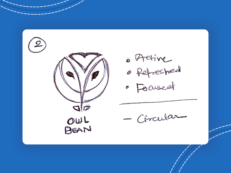
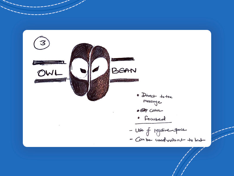
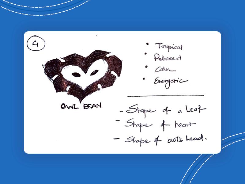
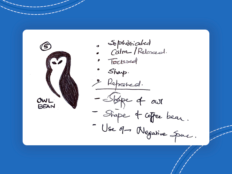
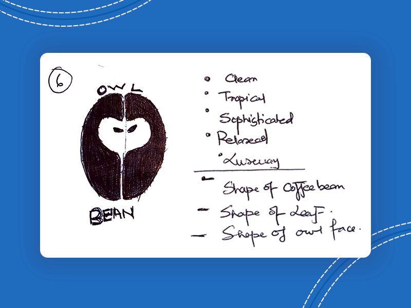
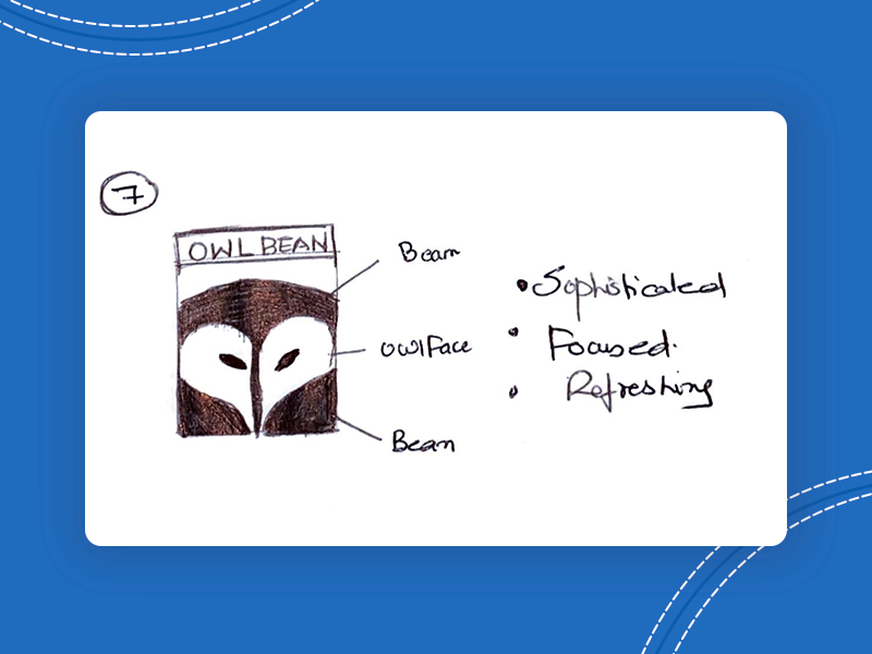
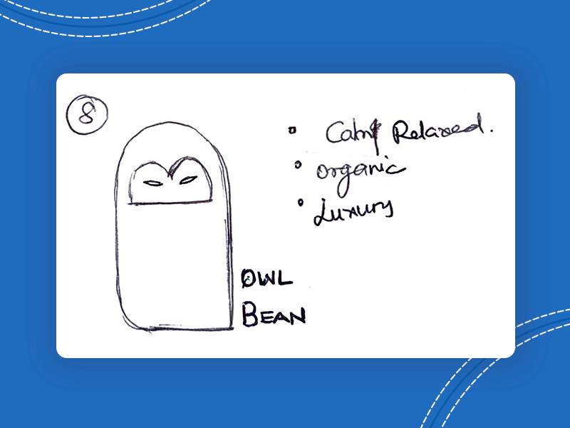
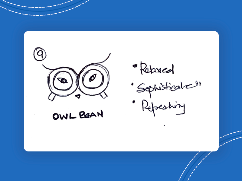
After finalizing the mood and feel of the brand, the next stage was to give an iconic identity to the brand which required sketching logo concepts, tailored based on the client’s requirements.
As we move forward, let’s recognize that this brand is alive, it’s fragile and still growing. The logo gives a face to the real body – the people of Owl Bean. The logo is how we would treat these people – with care, respect and intentionality.
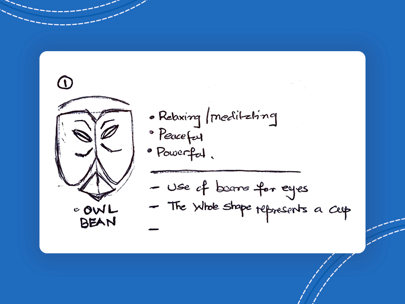
The Tailoring
Logo Construction
Once the sketches were initiated, a fusion of the ideated logos resulted in the birth of the final face of the brand justifying the name “Owl Bean”
The Identity #2
Brand Colors
The brand colors are developed carefully that evokes the feeling of relaxation, being close to nature, fresh, young and sophistication. These are the factors which makes Owl Bean stand-out among the typical premium coffee providers
The Identity #3
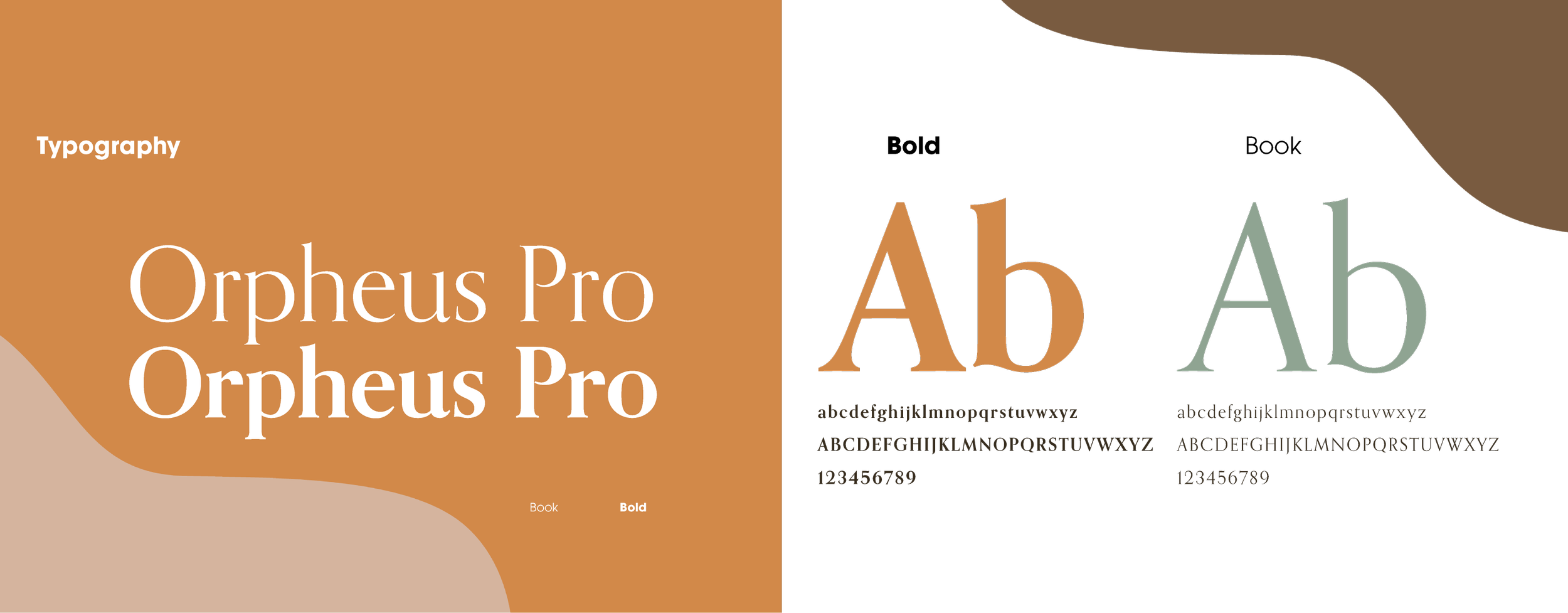
Typography
Once finalizing the mood and feel of the brand, the next stage was to give an iconic identity to the brand which required sketching logo concepts, tailored based on the client’s requirements.
The Face
Logo Iterations
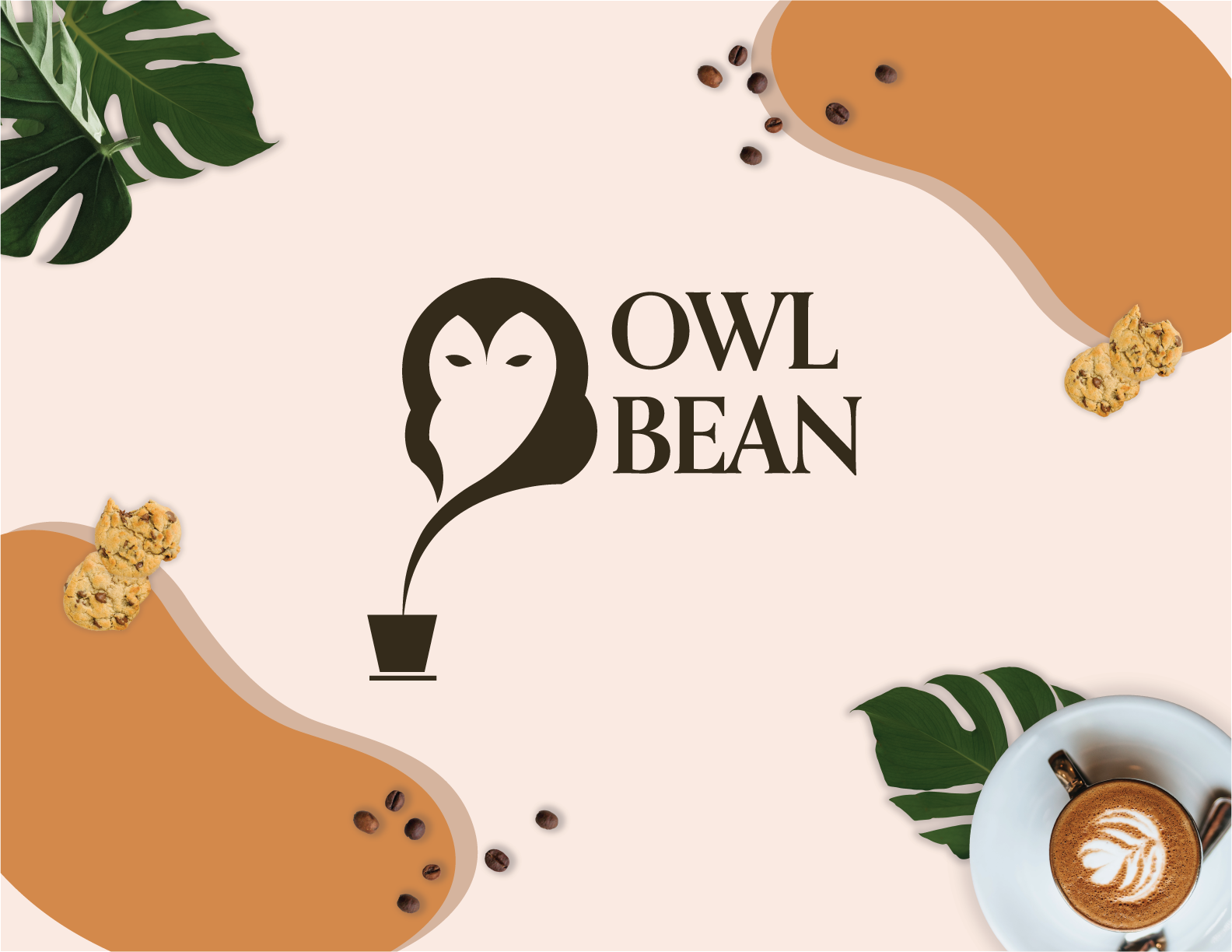
The integration of brand guidelines - Combining the typography and colors to the final logo established for brand identification.

Real World
Applications
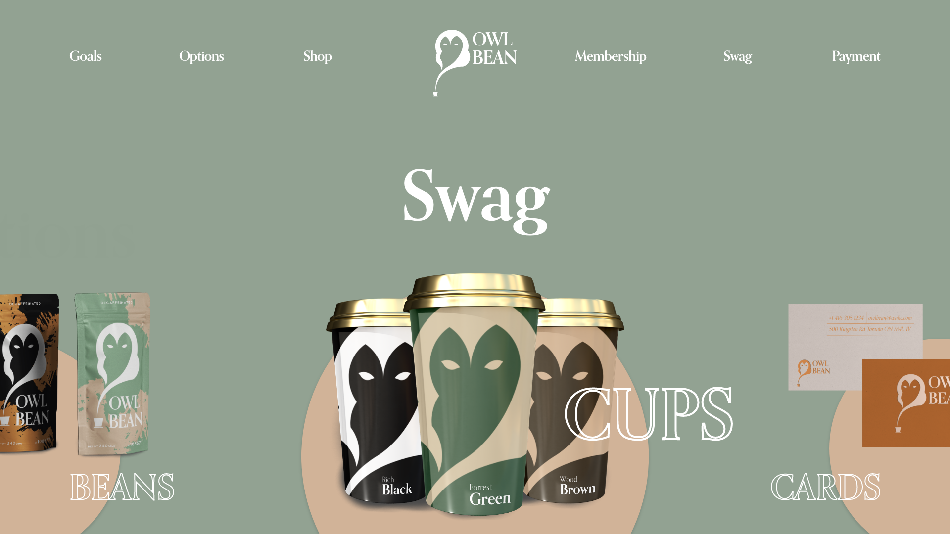
The place where Vision and imagination meets. Real life depiction of the brand as envisioned -
Young, Sophisticated, Tropical, Fresh and Organic
Final Touches
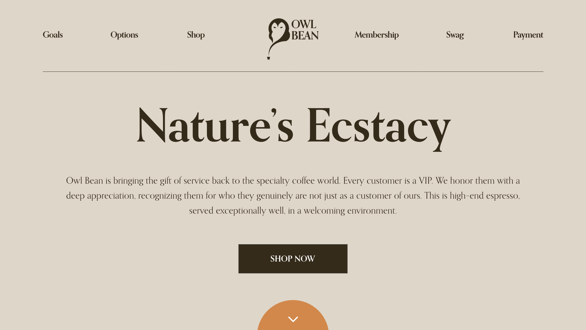
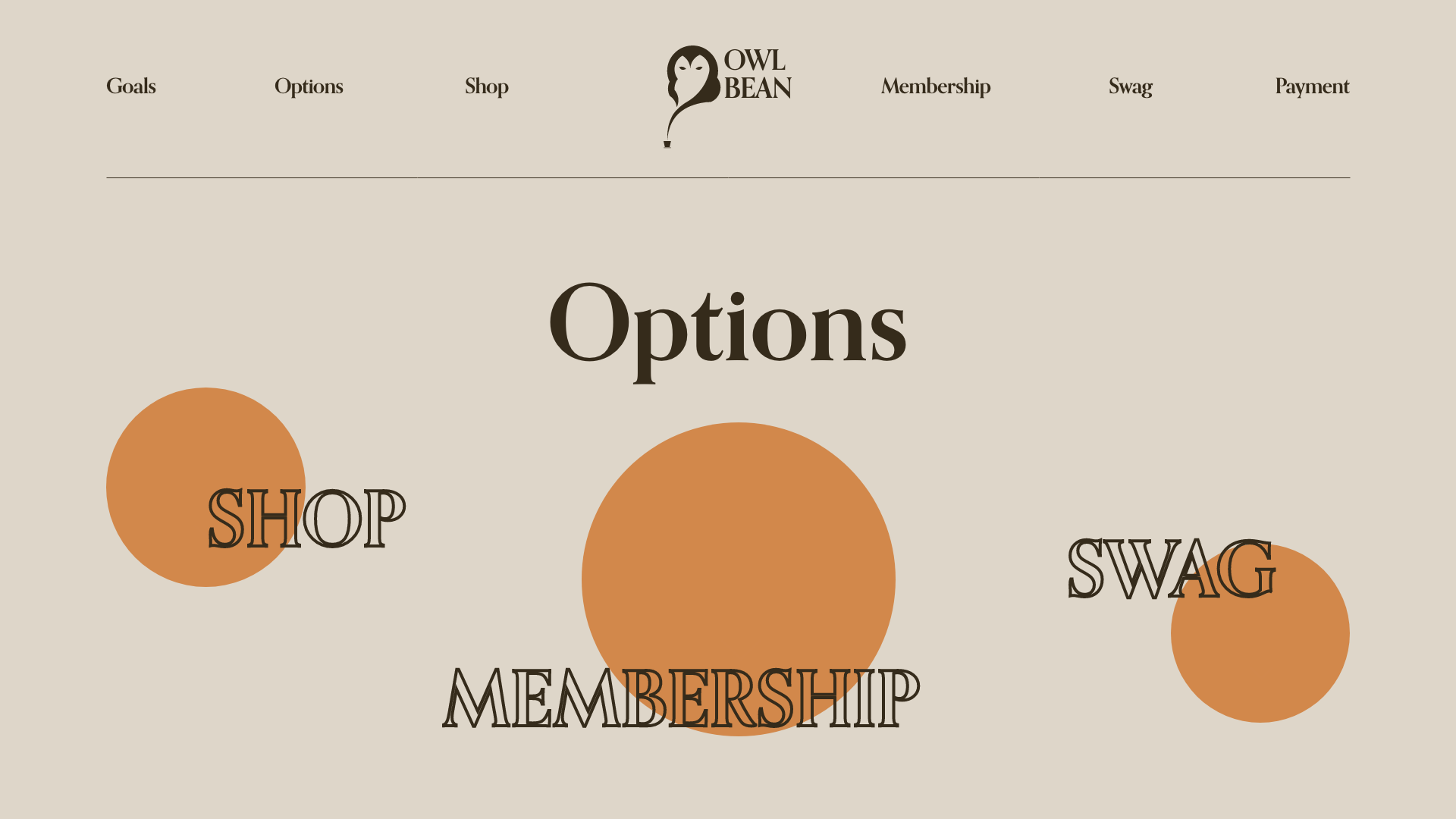
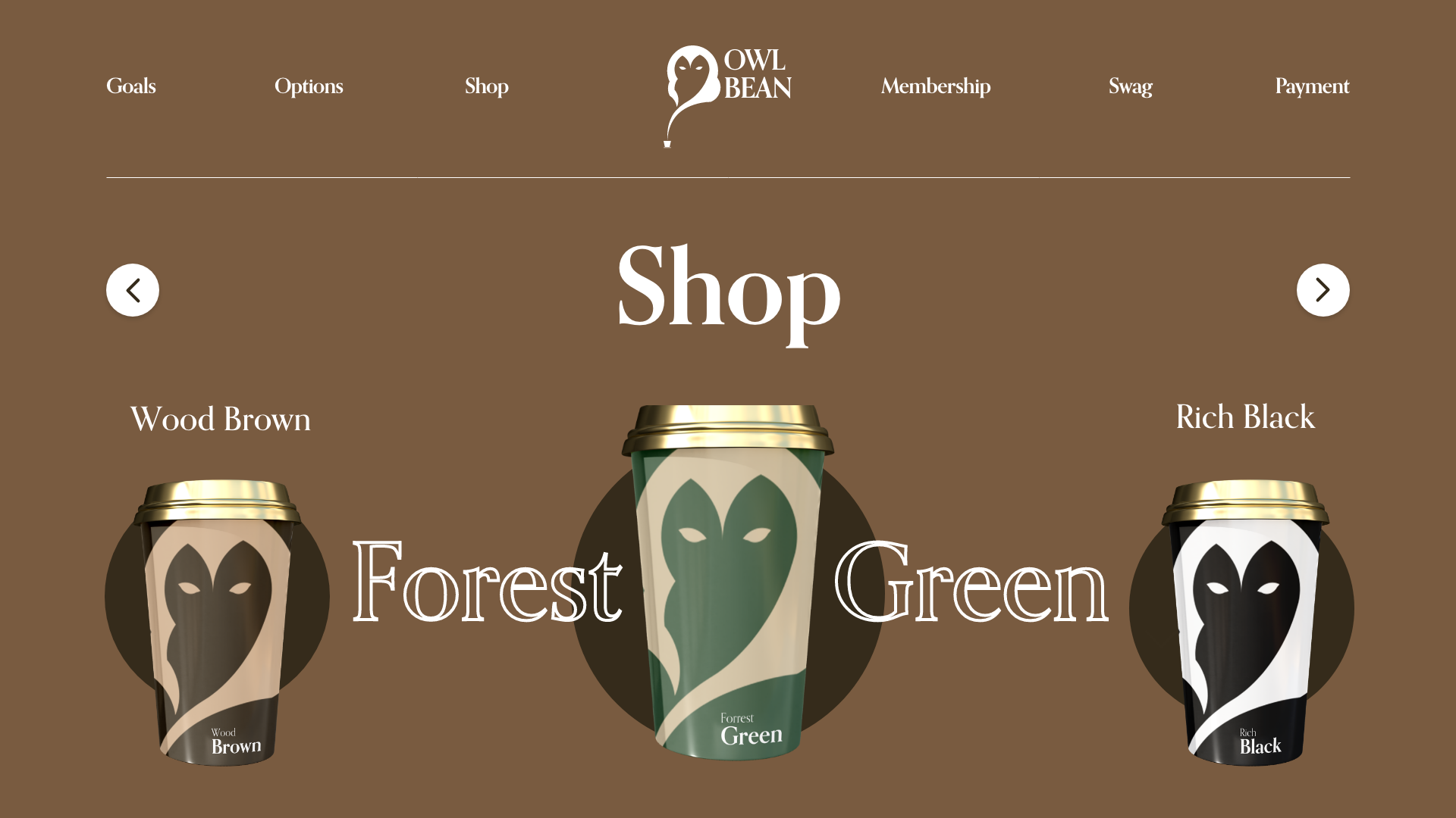
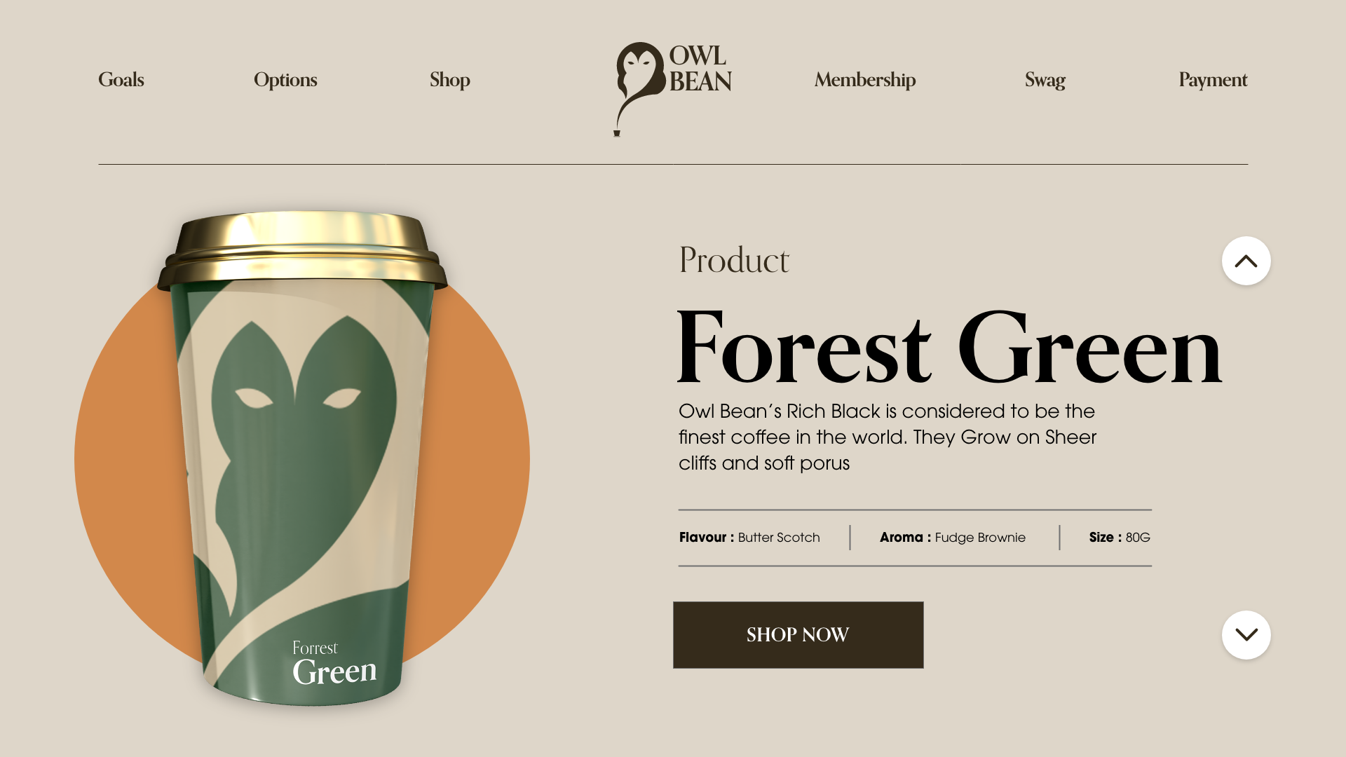
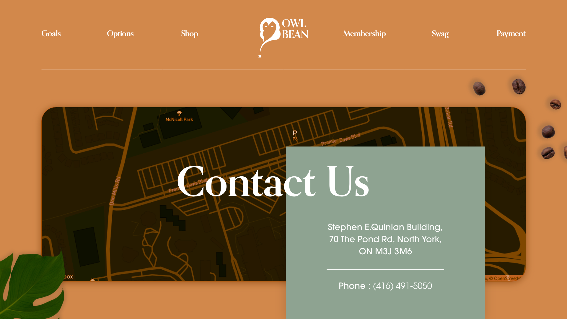
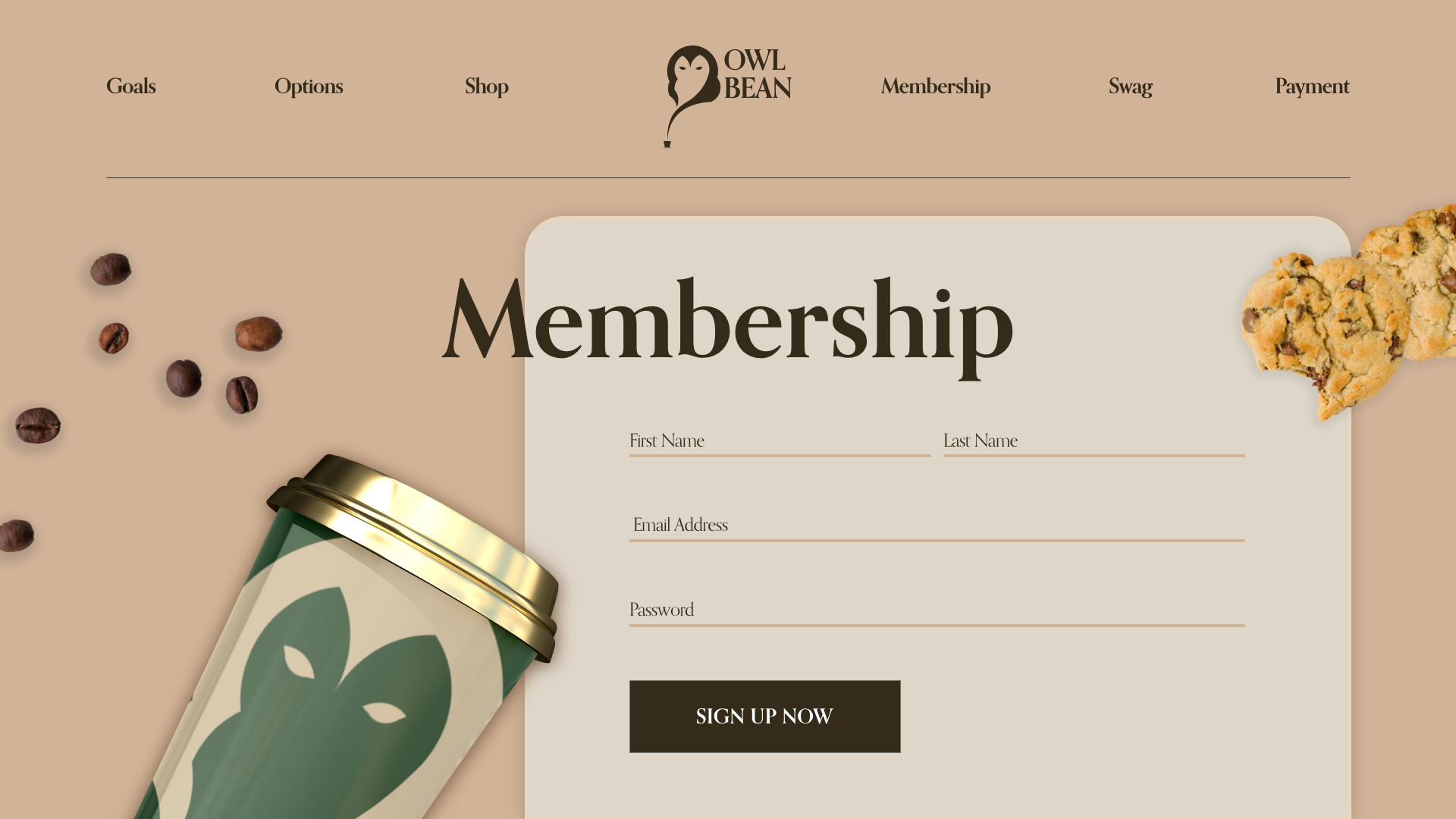
The Website
